[THE STRUCTURE OF A CASE STUDY]
UX/UI DESIGN
Design with Intention.
UX/UI for Small Business. Creativity Meets Structure.
Design isn't just how it looks. It's how it works.
For small business, good design means customers can quickly find what they need and feel confident enough to take the next step, like making an inquiry or booking.
A website can be beautiful and still fail. Slow load times, confusing navigation, buttons that don’t look like buttons and so on. Visitors won’t blame the design. They’ll blame your business.
That’s what separates UI from UX. One handles the visuals. The other handles the journey. Both matter. Neither works alone.
This page walks you through a real project, a tattoo portfolio, to show how small UX and UI decisions make the difference between a site that just sits there and one that actually brings in clients.
UX vs UI
UX is the structure. The invisible framework that decides whether a user reaches their goal or gives up.
It’s how someone moves through a site. Where elements are placed. What happens after they click a button. How many steps stand between them and what they came to do.
That’s why accessibility matters too. A website isn’t usable if not everyone can navigate it. Accessible design isn’t a feature. It’s a requirement for any product built for humans.
UI is the surface. The visual layer that shapes first impressions and builds trust, or breaks it instantly.
It’s the colors, typography, spacing, and visual hierarchy. Everything someone sees and touches.
That’s why UI isn’t just decoration.
Yoska Richard Tattoo - Portfolio UX/UI Case Study.
The Anatomy of a Case Study
A talented artist in Amsterdam. No website at first. Then the idea that AI search could help people find his work changed his mind.
The goal was to create a portfolio that not only showcases the artist’s work, but also helps convert visitor interest into booking inquiries.
My Role
- • UX/UI Design
- • Wireframes & High Fidelity Prototype
- • Front-End Development
- • User Research
- • Content
- • SEO Optimization
Project Overview
The Brief.
The brief was straightforward: build a portfolio that attracts new clients.
The real success metric was whether visitors could quickly understand the artist’s style and move toward booking a tattoo.
What Was The Main Challenge?
But the real challenge wasn’t technical, it was about projecting trust and clarity to future clients.
How do you present a visual artist’s work without overwhelming visitors? How do you balance the artist’s personal style with what clients actually need to see?
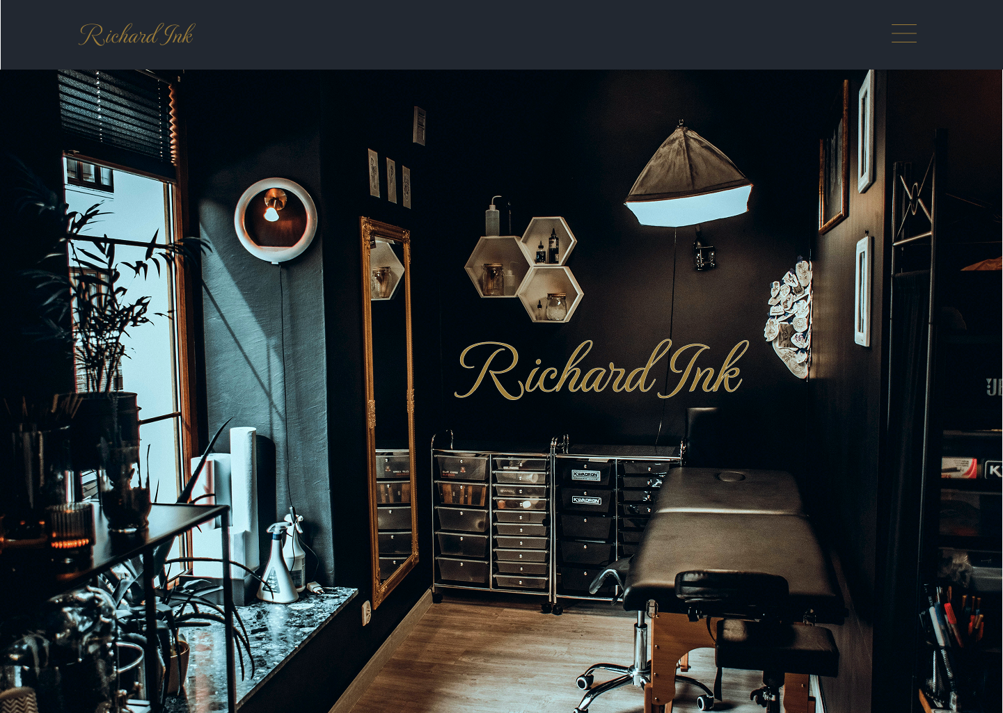
One early decision shaped the entire project. The artist originally wanted a larger background image on the homepage, a common approach in tattoo portfolios. I designed a prototype as requested. But the result felt generic. It looked like every other tattoo site. Busy. Unfocused. Distracting from the work itself.
The rest of the site needed the same level of care. Clear navigation. A portfolio that invites browsing, not endless scrolling galleries. Information that’s easy to find. Structured from beginning to end.
REQUESTED DESIGN PROTOTYPE
Project Overview
The Brief.
The brief was straightforward: build a portfolio that attracts new clients.
The real success metric was whether visitors could quickly understand the artist’s style and move toward booking a tattoo.
What Was The Main Challenge?
But the real challenge wasn’t technical, it was about projecting trust and clarity to future clients.
How do you present a visual artist’s work without overwhelming visitors? How do you balance the artist’s personal style with what clients actually need to see?
One early decision shaped the entire project. The artist originally wanted a larger background image on the homepage, a common approach in tattoo portfolios. I designed a prototype as requested. But the result felt generic. It looked like every other tattoo site. Busy. Unfocused. Distracting from the work itself.
The rest of the site needed the same level of care. Clear navigation. A portfolio that invites browsing, not endless scrolling galleries. Information that’s easy to find. Structured from beginning to end.
REQUESTED DESIGN PROTOTYPE
The Solution.
Instead, I proposed an animated hero for the opening page. I also encouraged the artist to invest in professional photography, something many tattoo portfolios skip. It makes a noticeable difference in credibility and visual impact.
The combination of custom photography and a clean, motion-driven layout creates a first impression that builds trust. The title, subtitle, and call-to-action sit within a layered composition that guides the eye without overwhelming the user. The artist agreed to both suggestions, and the final result keeps the work front and center. The subtle animation adds energy and a professional visual standard that stands out.
The full UX process – research, wireframes, and decisions on navigation, carousels, and content, is broken down below.
SUGGESTED DESIGN SOLUTION
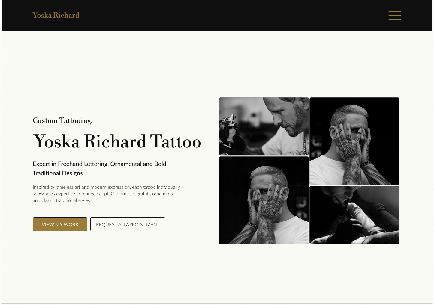
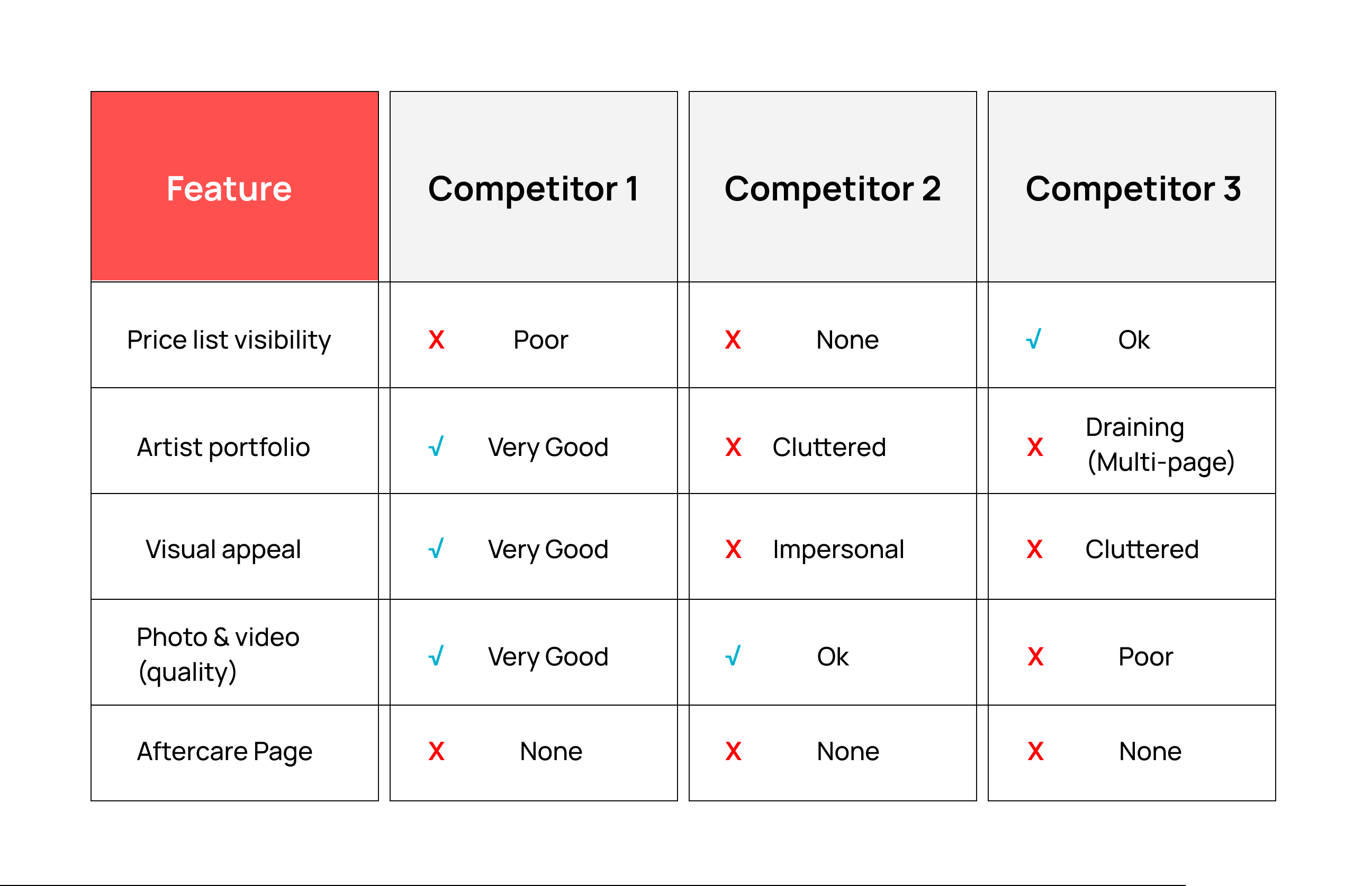
Competitive Analysis
Before staring, I conducted secondary research in search of valuable insights. I looked and compared at other tattoo portfolios in the Netherlands. What I saw was a pattern of missed opportunities.
Most sites rely on simple WordPress pre-built templates, functional but generic. Price lists, whey they exist, are often long documents with confusing conditions. Studio sites dedicate separate pages to each artist, each with an endless grid of images. The photography is inconsistent. Videos feel unpolished.
The result? A visitor experience that feels cluttered and hollow rather than curated and inviting. Browsing becomes a chore.
That observation shaped everything that came next.
CA Chart
Research & Discovery (Part One)
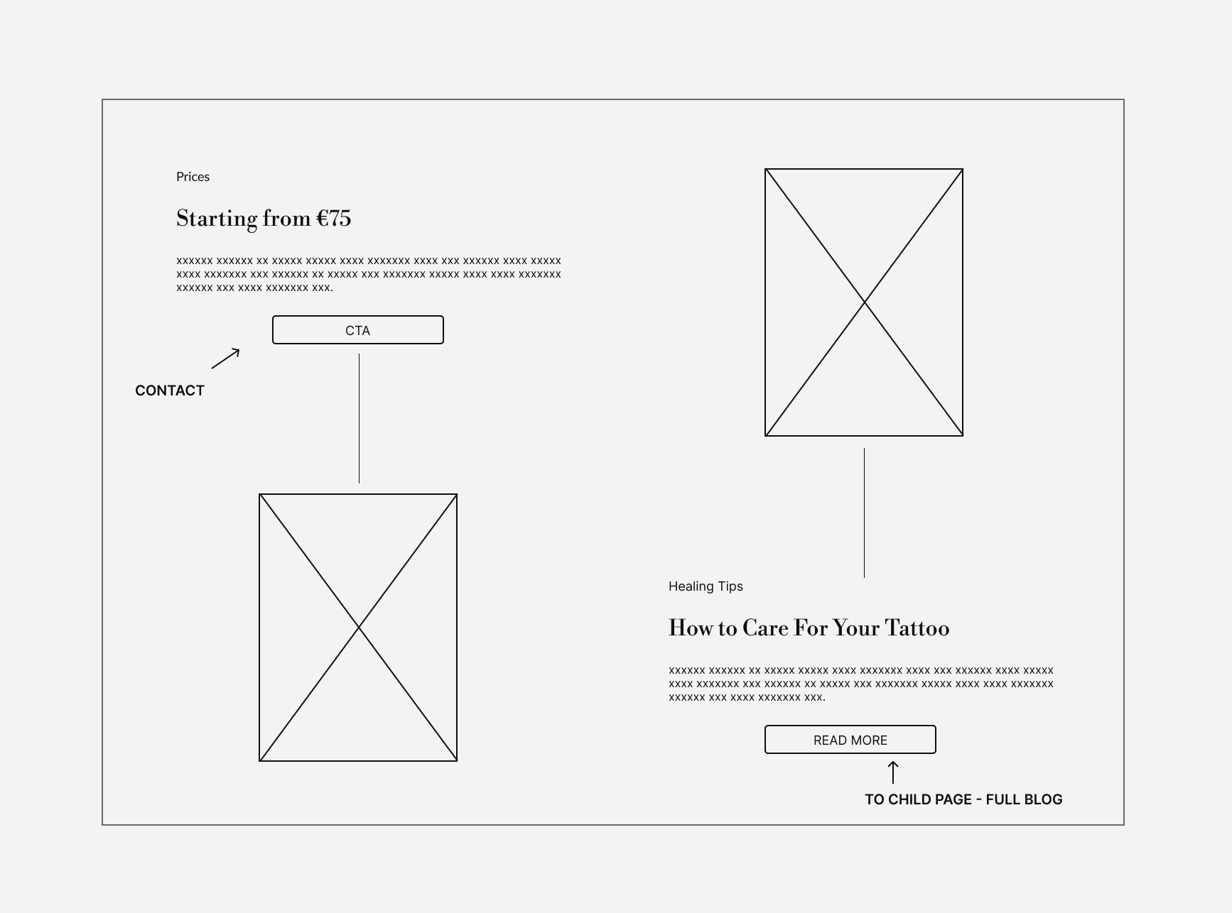
Price & Aftercare Section
Before a single wireframe or design decision, I started with simple questions. What does the artist need? What do potential clients look for? Where do they get stuck?
Yoska wanted his work to speak for itself. No clutter. Just clean, bold imagery.
Potential clients, on the other hand, need answers fast: style, availability, and how to book.
One of the biggest tension points was price. Most tattoo artists don’t list fixed prices because every design is different and time varies. But clients arrive at a portfolio expecting a starting point. Without it, uncertainty increases and some users leave before taking action. This directly impacts booking decisions, especially for first-time visitors.
The UX solution wasn’t a full price list. It was a starting point. A “from €75” that sets expectations without locking anyone into a fixed number. It provides clarity while keeping flexibility for custom work.
That starting price appears early in the experience. The rest of the site supports the decision-making process: how to book, the consultation steps, design agreement, deposit, and final pricing structure.
The design also addresses other user needs, including a clear path to aftercare and a portfolio structure that remains easy to browse without overwhelming the user.
The result is a portfolio that removes uncertainty for potential clients while staying true to the artist’s visual identity.
Wireframe
Price & Aftercare Solution
Research & Discovery (Part One)
Price & Aftercare Section
Before a single wireframe or design decision, I started with simple questions. What does the artist need? What do potential clients look for? Where do they get stuck?
Yoska wanted his work to speak for itself. No clutter. Just clean, bold imagery.
Potential clients, on the other hand, need answers fast: style, availability, and how to book.
One of the biggest tension points was price. Most tattoo artists don’t list fixed prices because every design is different and time varies. But clients arrive at a portfolio expecting a starting point. Without it, uncertainty increases and some users leave before taking action. This directly impacts booking decisions, especially for first-time visitors.
The UX solution wasn’t a full price list. It was a starting point. A “from €75” that sets expectations without locking anyone into a fixed number. It provides clarity while keeping flexibility for custom work.
That starting price appears early in the experience. The rest of the site supports the decision-making process: how to book, the consultation steps, design agreement, deposit, and final pricing structure.
The design also addresses other user needs, including a clear path to aftercare and a portfolio structure that remains easy to browse without overwhelming the user.
The result is a portfolio that removes uncertainty for potential clients while staying true to the artist’s visual identity.
Wireframe
Price & Aftercare Solution
Research & Discovery (Part Two)
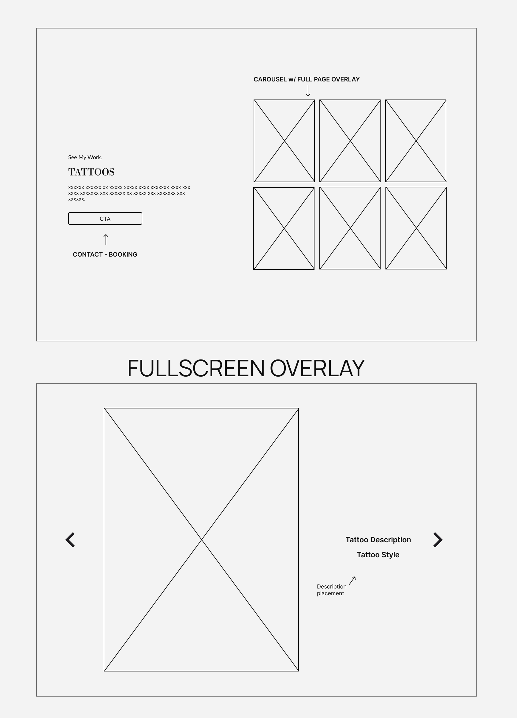
Portfolio Carousel & Overlay System
The portfolio needed to showcase the artist’s work and merchandise without overwhelming visitors. After reviewing other tattoo portfolios, a clear pattern emerged: endless grids tend to dilute the work rather than highlight it.
The goal was to create a browsing experience that feels curated rather than crowded.
The carousel approach was chosen to support browsing while maintaining focus. Instead of forcing users into long scrolls, it allows them to explore work at their own pace and focus on pieces that catch their attention.
The solution combines two layers: a carousel for structured browsing and a fullscreen overlay for detailed viewing. The overlay presents each piece in a focused view with supporting information, while allowing the users to continue browsing without losing context.
This structure lets users explore freely while maintaining orientation within the portfolio, supporting a smoother transition from browsing interest to taking action.
Wireframe
Carousel & Fullscreen Overlay
Research & Discovery (Part Two)
Portfolio Carousel & Overlay System
The portfolio needed to showcase the artist’s work and merchandise without overwhelming visitors. After reviewing other tattoo portfolios, a clear pattern emerged: endless grids tend to dilute the work rather than highlight it.
The goal was to create a browsing experience that feels curated rather than crowded.
The carousel approach was chosen to support browsing while maintaining focus. Instead of forcing users into long scrolls, it allows them to explore work at their own pace and focus on pieces that catch their attention.
The solution combines two layers: a carousel for structured browsing and a fullscreen overlay for detailed viewing. The overlay presents each piece in a focused view with supporting information, while allowing the users to continue browsing without losing context.
This structure lets users explore freely while maintaining orientation within the portfolio, supporting a smoother transition from browsing interest to taking action.
Wireframe
Carousel & Fullscreen Overlay
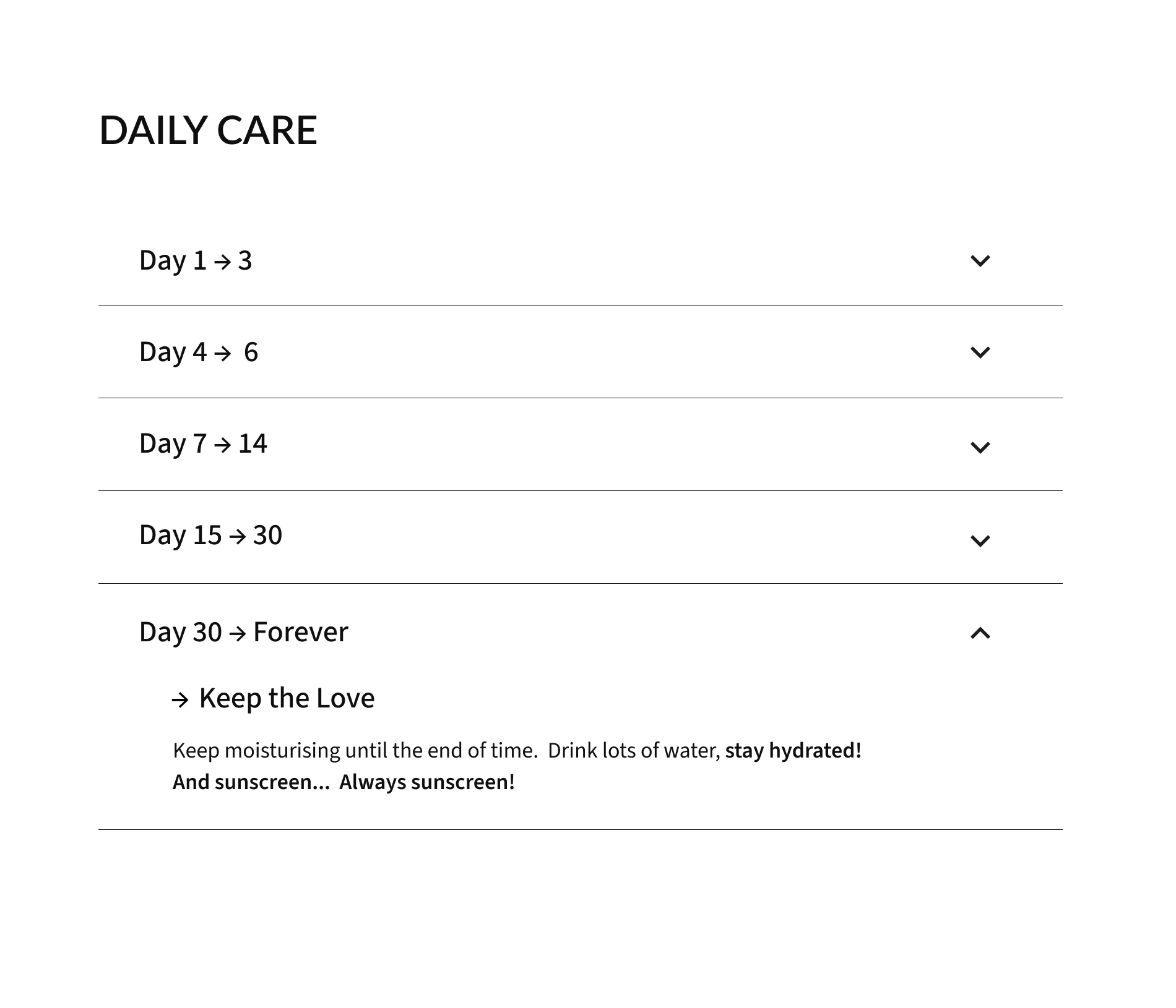
Beyond the Portfolio: Aftercare as Trust-Building
A tattoo doesn’t end when the client leaves the chair. That’s when the questions start.
How do I clean it? What lotion can I use? When does it start peeling?
Instead of answering the same questions over and over, I suggested an aftercare guide. A dedicated page with full aftercare information, with each section having a full range of information.
These include:
- • Essential tips for healing and aftercare.
- • Immediate aftercare.
- • Information regarding cling film vs polyurethane wrap
- • Day-by-day instructions using an accordion layout (see wireframe).
- • Why aftercare matters.
- • Common healing mistakes to avoid.
- • Final thoughts and ⚠︎ abnormal healing signs.
Clients get clear, trustworthy advice. The artist saves time. Everyone wins.
In UX thinking this it’s an example of a feature added with the user in mind and anyone who gets a tattoo will appreciate.
Low-Fidelity Wireframe
UX Decisions
Approach
These decisions were made to improve clarity, reduce confusion, and support the path from discovery to booking.
Key focuses included:
- • Clean navigation focused on portfolio, merchandise, bio and contact.
- • Image carousels to prevent endless scrolling.
- • Carousels overlays that allows users to see detail and style
- • Clear hierarchy
- • An Aftercare dedicated page to guide clients through the tattoo healing process.
Content Structure
Goal:
Make information scannable and organised.
Solution:
→ Divided the site into scrollable sections with clear and descriptive headings.
→ Introduced a subtle animation to the hero section to draw attention.
→ Applied a clean visual hierarchy to guide users to each component section.
→ Created separate carousels with fullscreen overlays for easy browsing and clear view.
UI Decisions
Visual Identity
The design process was centred around consistency, clarity and visual warmth.
Goal:
Reflect elegance and warmth through typography and colour.
- • Dark, moody palette to match tattoo aesthetic.
- • Image carousels to prevent endless scrolling.
- • Typography that matches the artist’s primary specialty.
- • Minimal distractions.
Solution:
Chose a clean, modern combination of fonts to reflect the artist’s speciality:
→ Libre Bodoni – Logo and large headers.
→ Lato – Component headers and sub-headers.
→ Source Sans 3 – content.
Applied a minimal, warm-neutral palette to reflect trust and typography aesthetics:
→ #FAFAF5 – Background
→ #0F0F0F – Font
→ #9C7C38 – Accent
Constraints & Trade-offs
No contact form. WhatsApp only.
This choice prioritizes fast, mobile friendly communication for potential clients and aligns with the artist’s preferred workflow.
Contact access is integrated directly into key components throughout the site, making sure users can reach out at the moment of interest rather than searching for a separate contact page.
Outcome
The final website gives the artist a clear, structured portfolio that supports a smooth journey from discovery to booking.